
CADILLAC 3
42

I now feel that I treat Substack more like an open workbook than a newsletter. I’m haphazard, wrenching at old posts without much consideration whether anyone would notice or care. This poem for example, got a layout makeover and some minor changes to its core language sometime after its app-prescribed email blast. I’ve made it significantly more annoying to read, but aesthetically it’s gone from a regrettable post to “I guess that’s fine” (as close to an A-grade as I get). But alas, who’s going back through the archive to ruminate but me? Would anyone discover these changes organically? It doesn’t matter I suppose; typically I’m engaging with this site on a desktop computer myself, some limp gesture toward sidestepping its saturation into yet another tiresome “social” media quagmire. I assume my readership is whizzing past on an iPhone in bathrooms and beds. And although it’s a comfort to imagine an audience (debilitating1 as it is helpful2), I don’t begin creating anything intending for YOU to consume it on a three by six screen with your pants around your ankles. Let the record be crystal clear: The final format of my work always be penned with the menstrual blood of virgins kept long in silver bondage, their ink expressed to silks from peacock quill bound in gold leaf and quagga skin. When you touch it your soul is mine. What you seen now on the other hand is cyber silly putty.
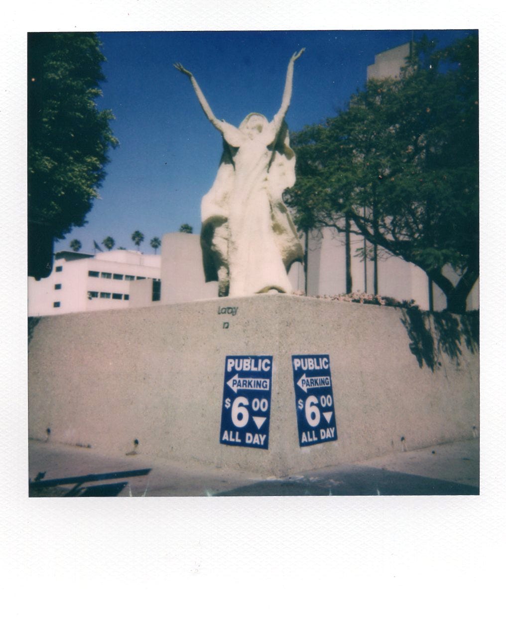
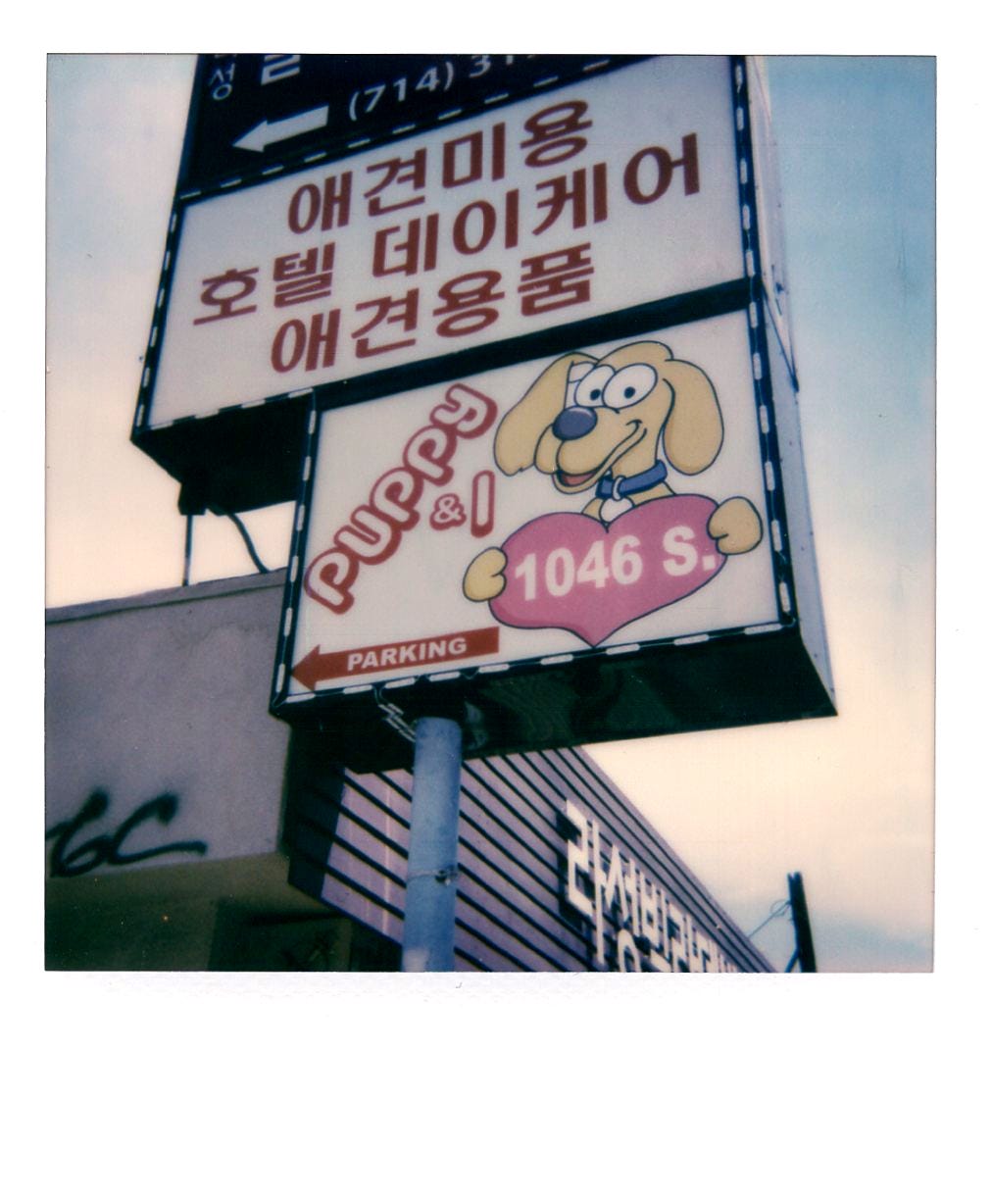
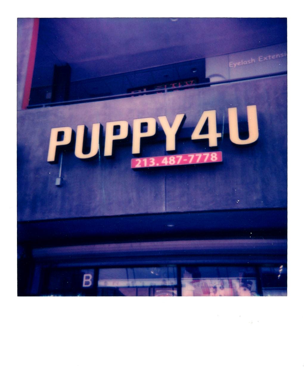
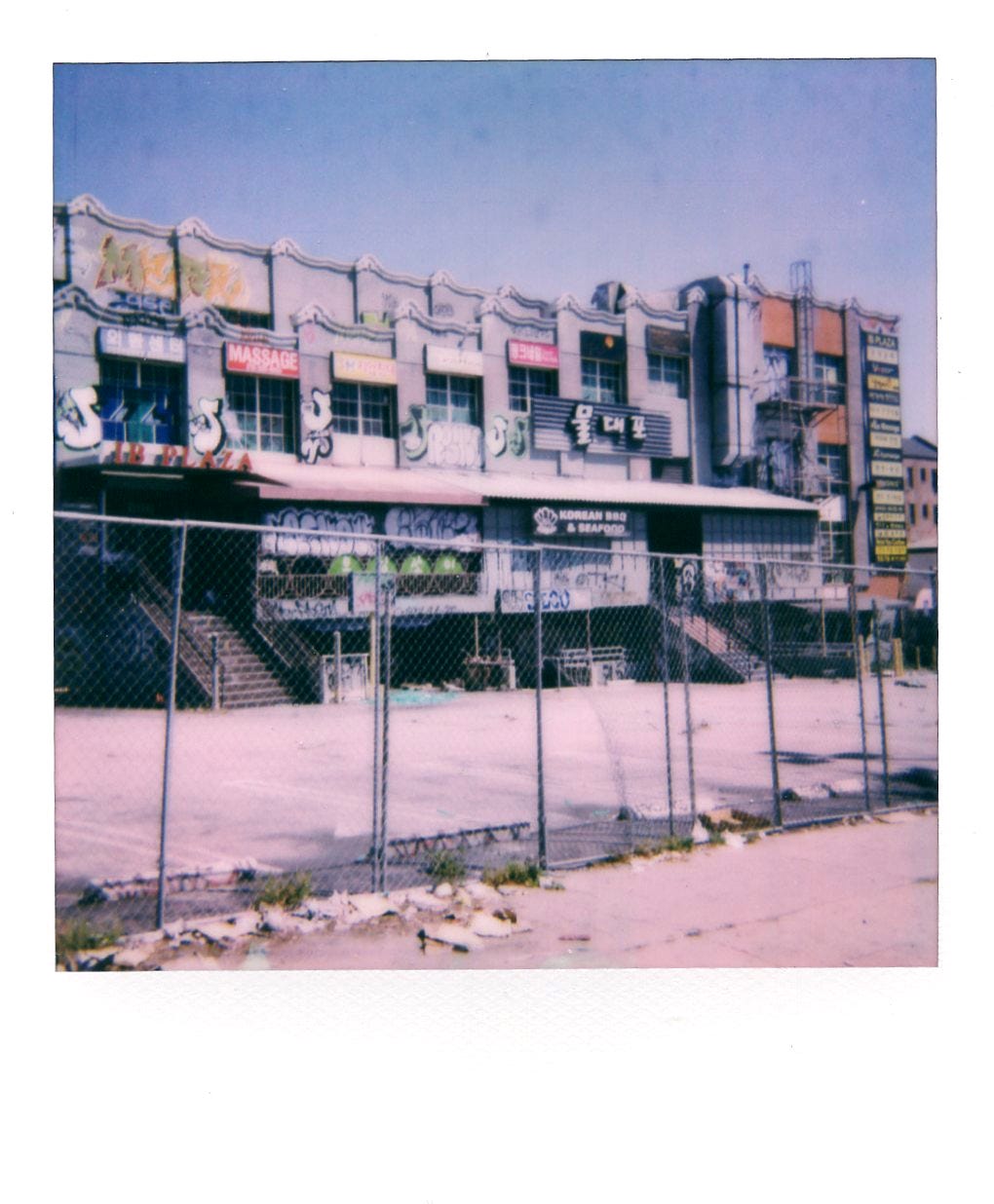
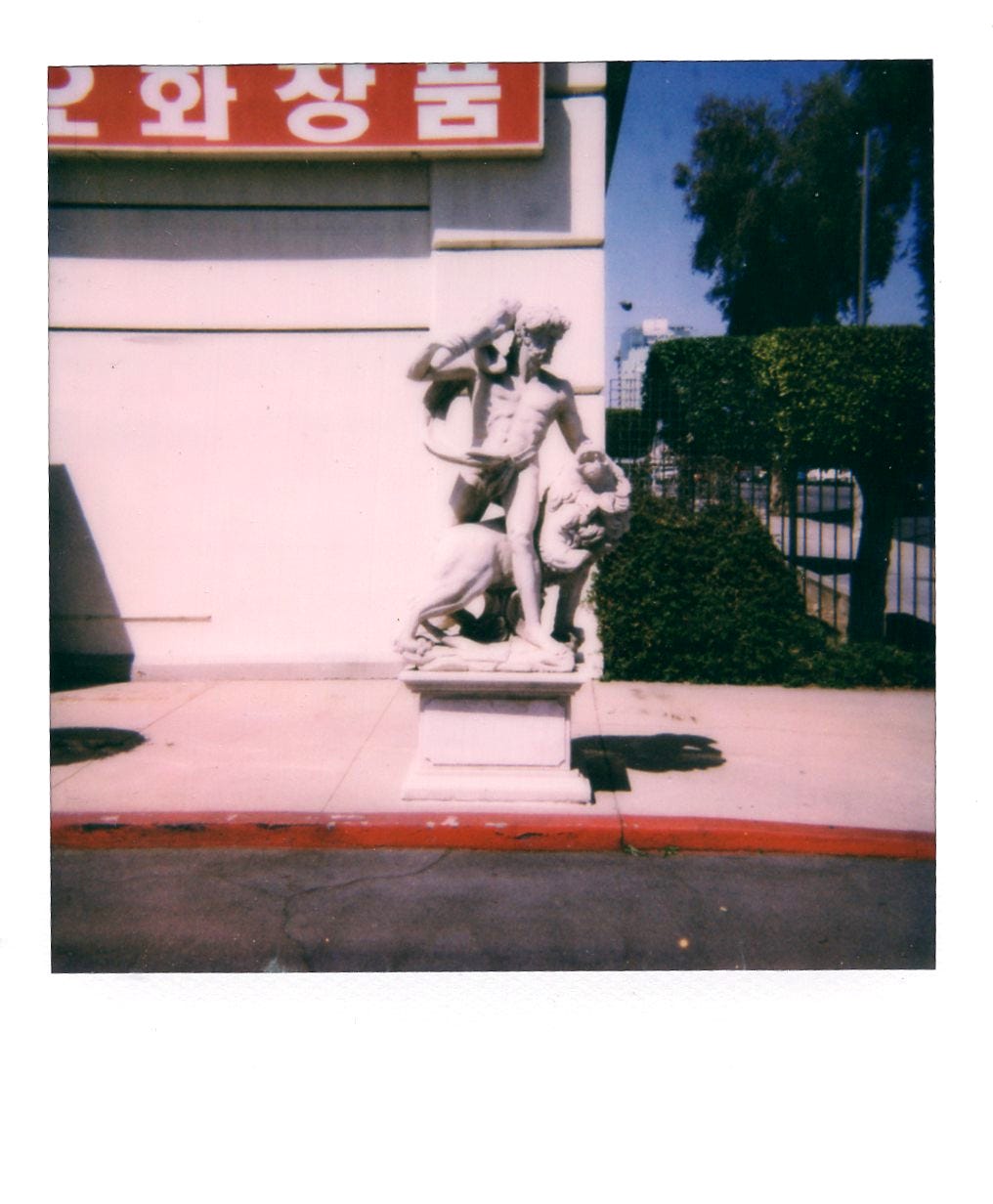
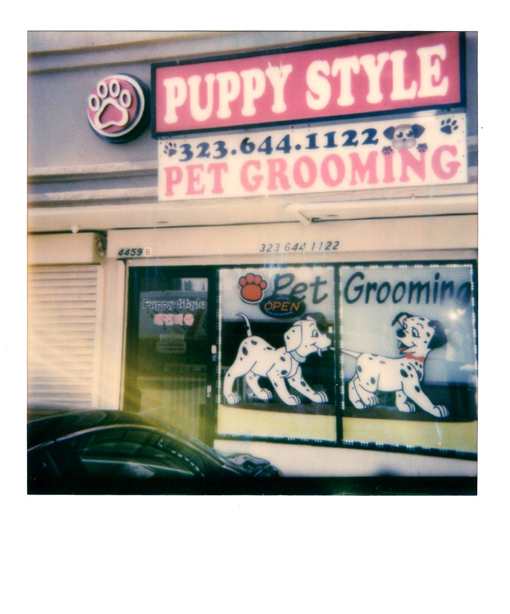
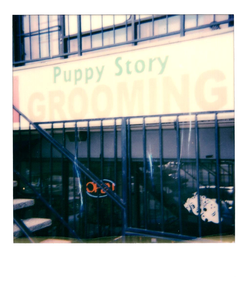
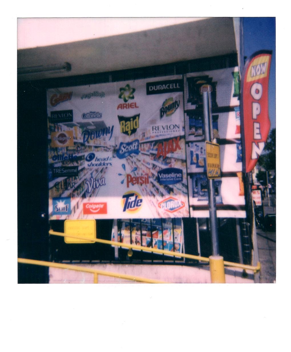
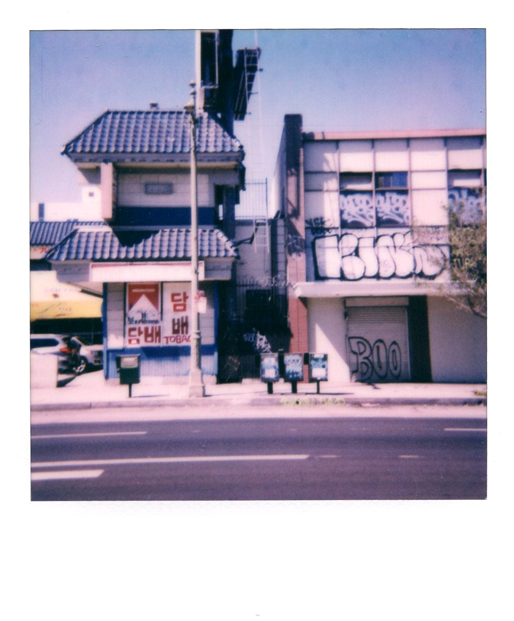
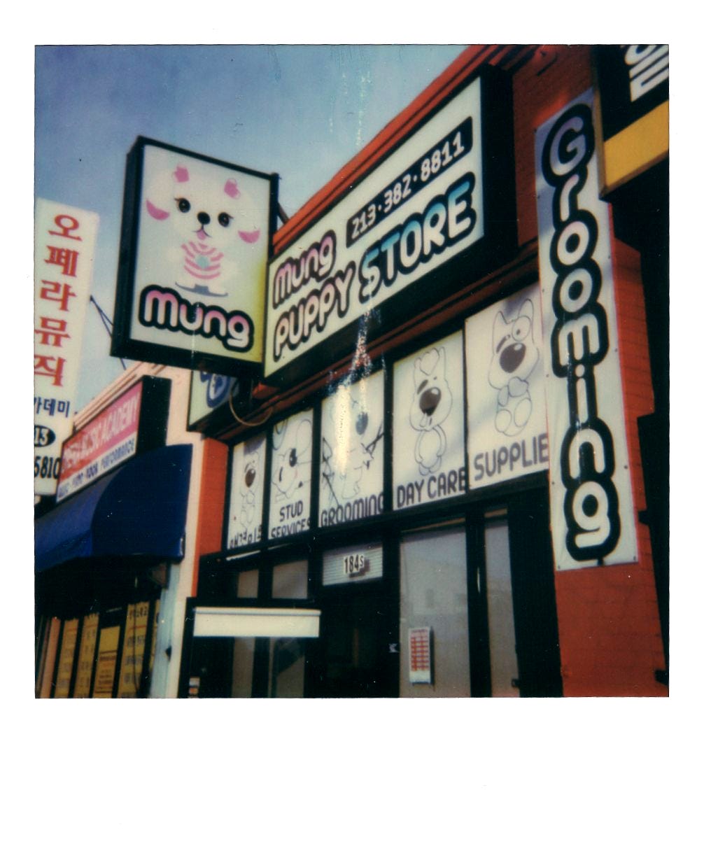
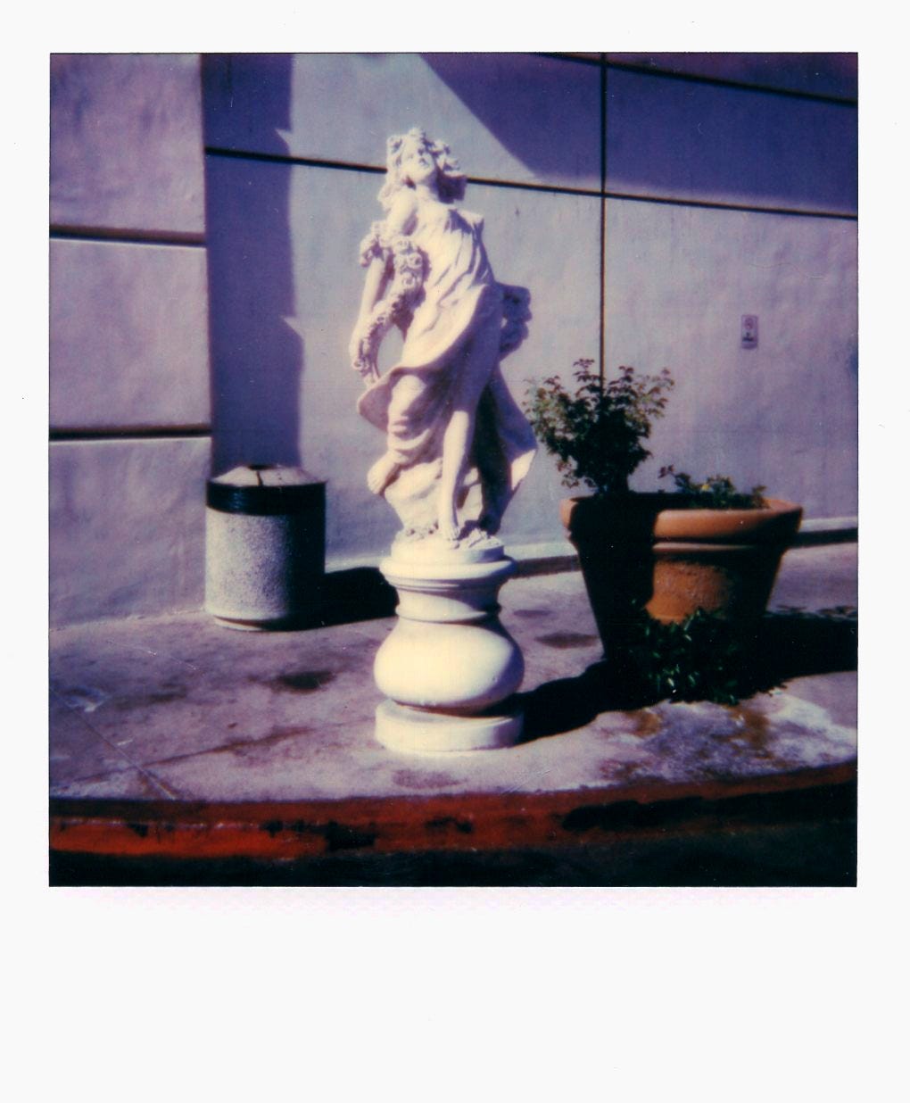
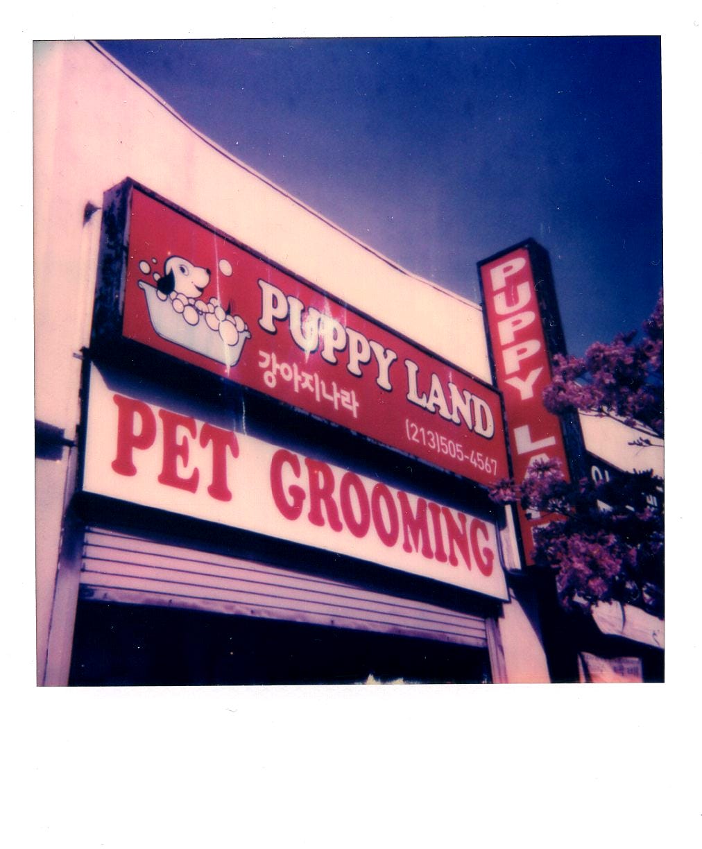
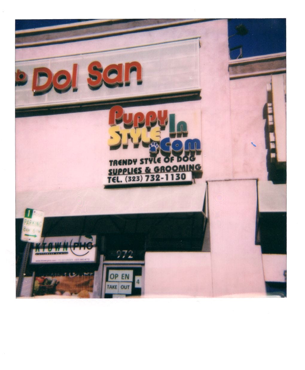
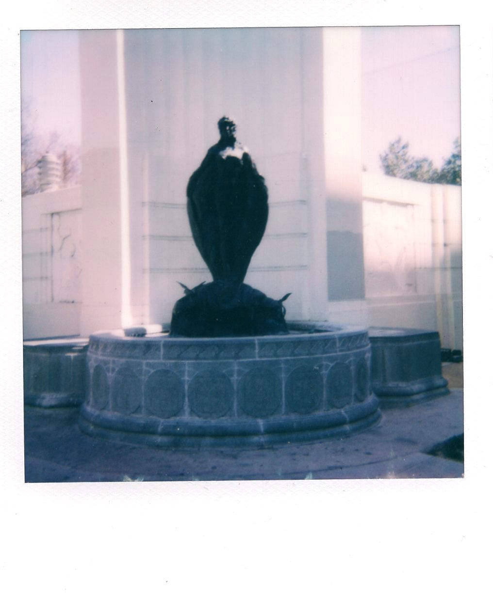
What I’m saying is that this Cadillac series never quite feels right on a screen. I have the actual photographs piled loosely and I’m sometimes unsure if there’s a better way to format them. I’ve mentioned my original idea before, but I also sometimes wish they could be duplicated as-is and passed along as a boxed set. With their scans placed together here or in InDesign, the method of composing a sequence clashes with some of the fundamental rules of visual storytelling cemented in my mind. A major one of those rules being a refusal to pair similar images near one another—this is about alertness, not boring the audience. But the joke when I shot a lot of these was the proximity of repeating themes, and that point of the collection is a part I fear losing whenever I’m arranging… Rococo maintains balance but eschews symmetry, right? But rococo is ornate where L.A. is cubic, shabby, and Lego. Here I am trying to make it work, but it definitely doesn’t. Especially not scrolling scroll-ing s c r o l l i n g vertically, wherever you happen to be taking this in.
Hm. Well, here’s more of 2020 on instant:


Tell me if you’re having fun.
Debilitating like: rather than making what I feel to be “art” I find myself making what I feel to be “content.” This is a drag.
Helpful like: you love me, you really love me.
I was having fun then I had to put in a number sent in a text to my phone just to leave this comment
FUN